
Painting Reflections
Do you paint reflections? Maybe you just like looking at them? Personally I LOVE painting them, but only since discovering these tricks…
These paintings were done very quickly using oil paints, and the method described below.
Read on to learn how to use logic, and the special properties of oil paints that work a treat for reflections!
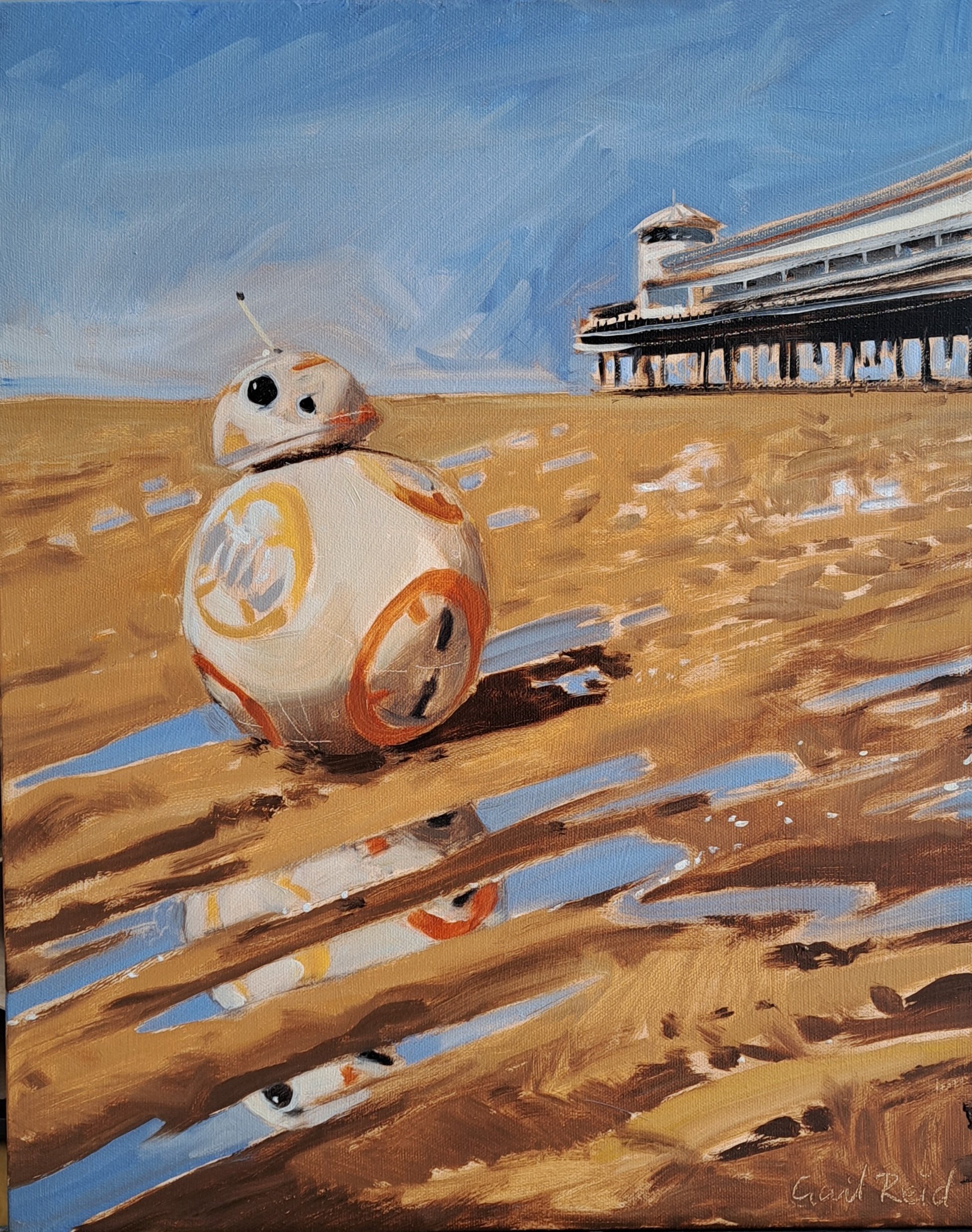
With special thanks to the Aga Kubish Art Gallery & Studio for hosting my BB8 painting demo in the gallery window.

Observation and planning
Observation is essential. But as with figure drawing, understanding the structure of what you see really helps with interpreting and selecting what you’re going to include in your rendition.
Start with a composition sketch - even a tiny monochrome thumbnail helps, particularly when reflections are a feature that you want to make room for. This sketch was an investment of a few minutes, allowing me to consciously design the composition. It saves time if you start painting knowing the size and position of key elements, in this case the Grand Pier in Weston super Mare, BB8 (Star Wars character), and the puddles on the sand. The reflection was intended as a feature, so you can see I left plenty area below BB8 in anticipation. This kraft paper and sketching technique are SO useful for getting information down quickly. see my boost your sketching blog for more info and links to materials.

The structure of reflections
OK. Here’s the logical bit. The rule to remember about reflections (whether on a lake, a puddle or even another reflective horizontal surface like a shiny table) is that they are symmetrical about an imaginary horizontal line of reflection.
This is really easy to apply in real life, once you understand the basic principle. The pictures and steps below will take you through this.
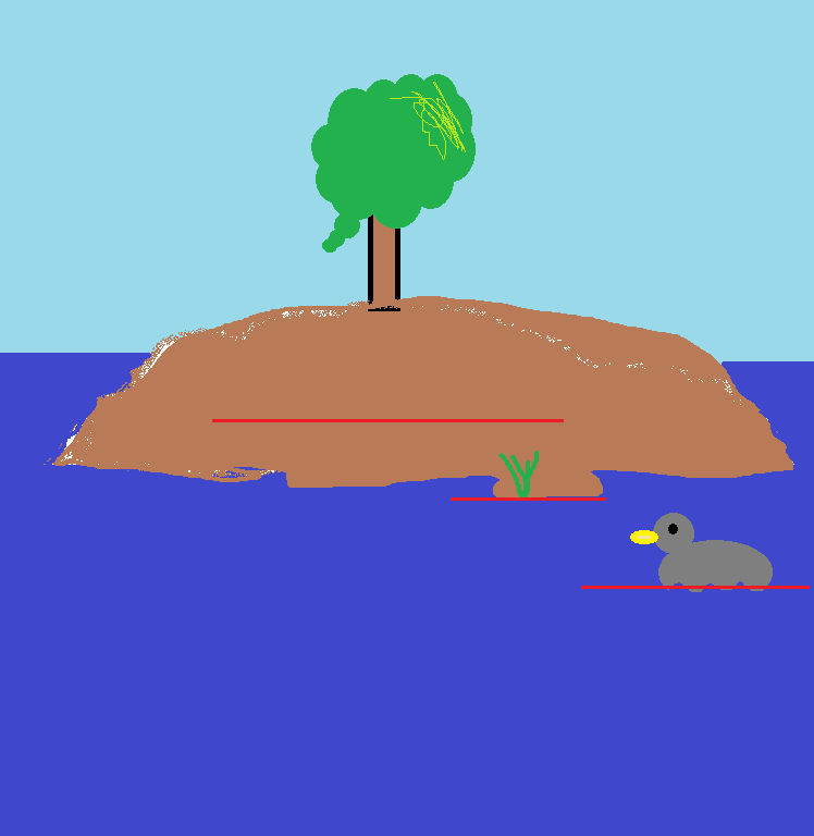
1. Draw an imaginary horizontal line, where it would be if it was a red stick floating on the water surface directly under the subject. This line is different for different subjects in the picture. It’s easy to imagine when the subject touches the water, like the duck and the reeds. But for subjects above the level of the water (like the tree), you need to imagine the plane of the water surface extends under your subject.
Nb when working from life, the location of the red line depends on your eye level, and the distance between you and the objects. But if you just mentally extend the surface of the water under your subject, it’s intuitively easy to locate once you understand the concept.

2. Imagine you’ve cut out the image of the ‘real’ thing, and mirrored its reflection in its line of symmetry. So the tree, reeds, and duck all have a different line, because they’re all at a different distance from the viewer.

3. Using observation of the scene, adjust the interference on the reflection. You need to break it up to show the body of water, but also the reflected image. It will depend on the light how much the reflection colours vary from the real objects. it will depend on the wind etc how bumpy the water surface is, and how much disruption there is on the surface. Nb there is little/no sky colour on the surface of the water where the tree and duck reflections sit. This is because the tree obscures the sky behind it. But the darker blue ‘body’ colour of the water still plays across the tree’s reflection.
So, here it is applied to BB8:
Welcome back to my internal monologue. This is the process I used for a 2 hour live demo, in the gallery window, applying the principle above.
I put a wash of burnt umber and paint thinner over the whole canvas to knock back the glaring white. This meant I could then figure out the composition on the canvas using a combination of wiping-out the lights with a cloth, and reinforcing the darks with a brush dipped in burnt umber oil paint.
On the canvas, I mapped out the sphere of BB8's body by ‘drawing’ with the brush round the end of a full kitchen roll. I added the head, marking the angle of the neck with a clear dark line. I then mirrored these shapes directly underneath, using the line of reflection, and being very careful to keep them vertically alligned:

1 - The red line is BB8’s reflection line.
The black line is the vertical (on the canvas), running through the point where BB8 touches the sand. This is to indicate that even though BB8 is tipped over, the black line must run through the central sphere of the body.
The blue line is the axis of symmetry of BB8, so you can see it is mirrored in the red line. This is to demonstrate the location of the head.

2 - The thin black line is the pier’s reflection line. I haven’t bothered drawing in a mirror image of the pier, but I put a few white spots as markers in the sand, to remind me that the pier would be reflected in the wet sand there. The elipses show the corresponding sections of pier that are referenced in the white reflection spots.

3 - The painting without the imaginary lines. The blue areas are where the puddles extend beyond the edge of BB8’s reflection. They are the sky reflected in the puddles. These equate to the reflections of the turquoise sky behind the tree in the previous pictures. They are my markers showing which sections are going to be puddles.

4 - I’m building up BB8 and the reflection simultaneously.
Even though I’m working from a reference photo on my tablet, I also have BB8 set up in a sand tray, so I can observe from life. I took care to observe the values in the core shadow carefully on the sphere, squinting at the model (if you squint at BB8 on the finished painting you may be surprised at how dark the shadow side of the sphere is). This contrast between light and dark needed to be included in the reflection too.

5 - You can see in the previous image that I start to neglect the detail of the reflection in the areas that won’t be puddles (marked in green on picture 5). The areas of BB8’s reflection that fall between the puddles will be wiped out anyway, as they will be sand on the finished painting.
Reflections are generally slightly less saturated and slightly more tonally muted than the original. To give the impression of still water and bright sun (and in the haste of a 2 hour demo!) I ignored this rule, and just used the same loaded brush for both BB8 and reflection.
I could then focus on the form of the humps of sand, using darker form shadows, consistent with the light direction of the sun falling on BB8. Also BB8’s cast shadow. Note that the reflected sky in the puddle in BB8’s cast shadow is undimmed by being in shadow.
The magic of oil paint
Now for the cool things that oil paints are particularly good for:
Opacity v transparency - Using reasonably dilute, transparent oil paint (mostly burnt umber) for the sand, I could easily wipe back to the toned canvas below. Throughout the sand areas, the transparent application allows the light of the room to bounce back off the white canvas below, giving the sand a bit of a warm sunny glow. Using opaque oil paint (with white in it) for the sky, pier, BB8, and reflections, made these really pop by contrast. It helps show that the sand exists on a different plane, literally and conceptually. The two worlds meet in the bounced light coming up from the sand below the core shadow on BB8’s body, which is relatively transparent and warm.
Colour temperature - Keeping the sky and pier cool, (in comparison to the warmth in BB8 and the sand) helps send them ‘back’ into the distance.
Working alla prima in oil, it was really easy to wipe out the areas of dry sand between the puddles with a cloth dampened with paint thinner.
Once I'd laid in sand and sky, I used a long thin 'rigger' brush to sweep the thin white lines of the pier, BB8's antenna, spot the highlight on the eye (instant character, as per Soggy Rabbit, if you know you know!) and a few sparkles on the sand.
Finally, my trusty dart was really handy for scratching fine lines to suggest the pier structure, the patterns on BB8's surface, and the signature. This wouldn't work in acrylics, as they dry so fast, but in a direct (painted in a single sitting) painting like this it's a really useful thing to have up your sleeve.
Bonus tip on painting water
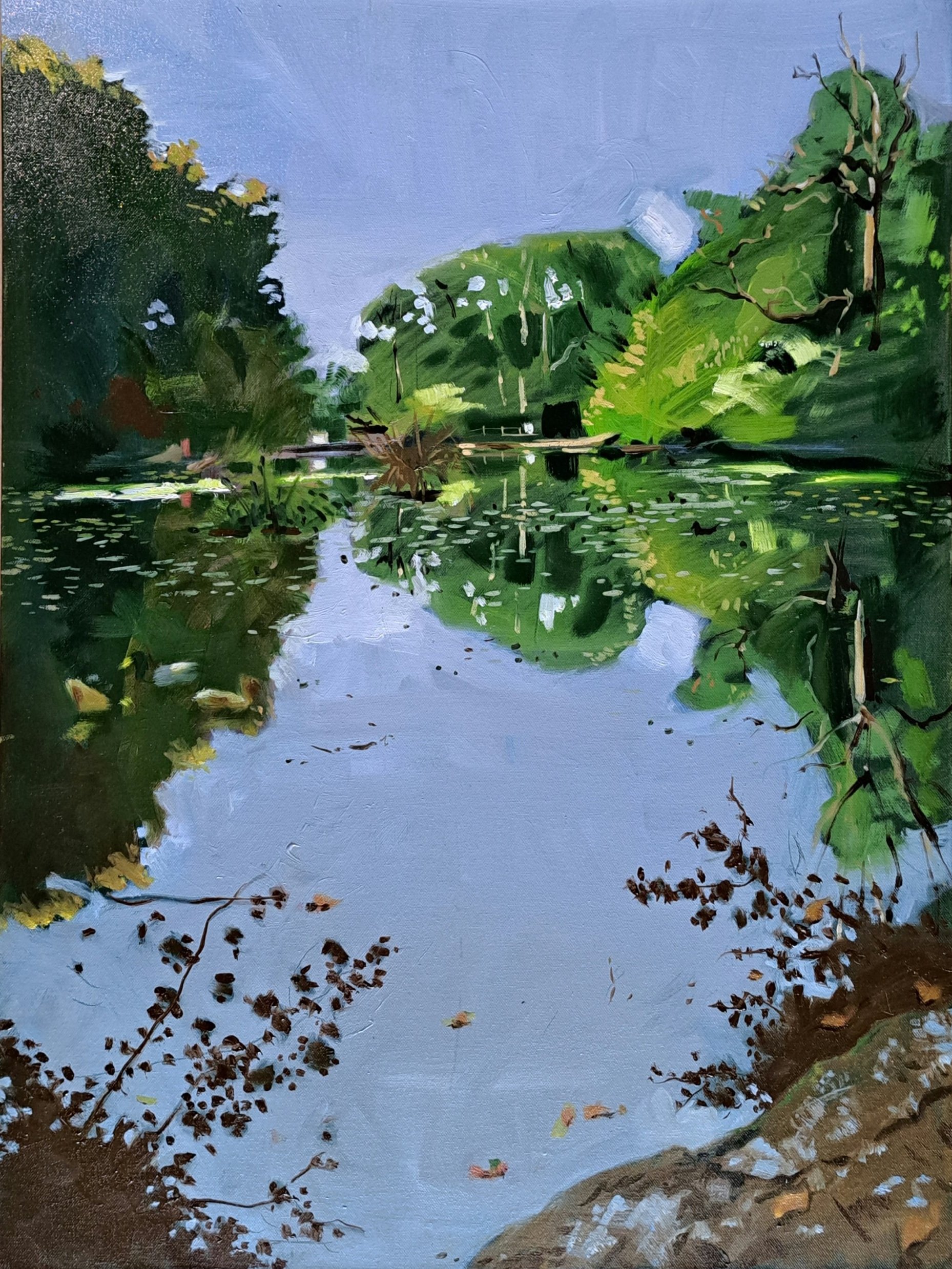
I hope that now you can look at the painting below (painted alla prima from life), and see that the sense of depth is achieved by controlling the position of the line of reflection for each discrete element. So, well done for paying attention (or scrolling down) all the way to the bottom. As promised, here’s your extra tip about painting water:
I would encourage you to paint any body of water, and reflections, using a variety of stroke directions, erring more on the vertical than the horizontal. Then to create ‘shimmer’ (horizontal flashes of reflected sky where the water surface is at a different angle due to tiny wavelets), or (as in this case) lily pads, and floating orange leaves, you can cut through at the end with horizontals. Less is more - if you find they look really effective, quit while you’re ahead, and don’t be tempted to cover the whole surface. Unless you want to!
Thank you so much for reading. Please share this blog with anyone who might be interested, it really helps extend the reach of my content. You can copy this address into a Facebook post, Whatsapp message, email, whatever!
https://www.gailreidartist.com/blog/reflections
Questions or observations are always welcome in the comments.